Queen album covers ranked
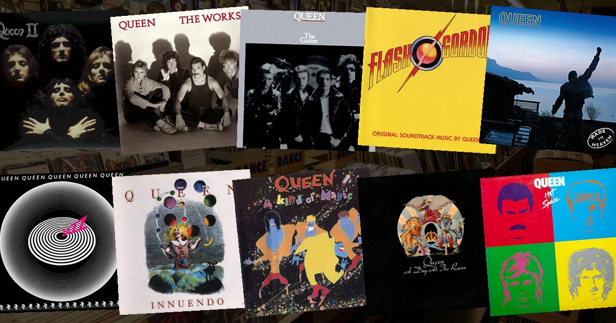
Queen treated their sleeves the way they treated their records — as theatre. Freddie Mercury even drew the band's most famous crest himself, and every cover that followed played with the same mix of grandeur, wit and a complete refusal to be boring.
Here are all 16 Queen album covers we have in the game, ranked from the most recognisable to the least.
1. A Night at the Opera (1975)
 A Night at the OperaQueen · 1975
The white crest, designed by Freddie Mercury himself, wrapping the band's name around a phoenix and a crown. It looks like a coat of arms for a royal family that happened to write "Bohemian Rhapsody". The most instantly recognisable Queen image, and the one every other band of the era wished they'd thought of.
2. Queen II (1974)
 Queen IIQueen · 1974
Mick Rock's photograph of the four of them, faces lit from below, hands raised in the air — the exact shot that would later open the "Bohemian Rhapsody" video. Dark, dramatic, faintly vampiric. It's the cover that invented Queen's mythology before the songs had quite caught up.
3. News of the World (1977)
 News of the WorldQueen · 1977
A giant robot, its hand dropping a crushed human figure, holding the limp body of the band. Frank Kelly Freas's painting was originally the cover of the October 1953 issue of Astounding Science Fiction, illustrating Tom Godwin's story "The Gulf Between" — drummer Roger Taylor owned the issue and suggested it to the band. Pure, strange, unforgettable pulp.
4. A Day at the Races (1976)
 A Day at the RacesQueen · 1976
The black twin of A Night at the Opera's crest, the same heraldry turned to shadow. Where the white crest was triumph, the black one is mystery — a mirror-image sleeve that turned a one-off design into a pair.
5. Innuendo (1991)
 InnuendoQueen · 1991
A jester, a harlequin, a troupe of figures from the medieval world — drawn, like much of Queen's best art, in a style that feels both ancient and new. Mercury's last album, and a cover that knew it was a farewell without saying so.
6. The Miracle (1989)
 The MiracleQueen · 1989
The four band members' faces digitally merged into a single composite portrait — one face made of four. It was the first time all four Queens appeared together on a sleeve since the early days, and the merge was a quiet answer to years of "who's really the star?" gossip.
7. Made in Heaven (1995)
 Made in HeavenQueen · 1995
The bronze statue of Freddie Mercury on the shores of Lake Geneva, silhouetted against a dusk sky. Released after his death, it's the most moving cover Queen ever put out — a memorial that doubles as a thank-you.
8. Jazz (1978)
 JazzQueen · 1978
The naked women's bicycle race — dozens of riders, all stark naked, racing around a track. It caused uproar on release and got its accompanying poster (and the "Bicycle Race" video) banned in the US. The sleeve is the joke, and the joke is that there's no jazz on the record at all.
9. The Game (1980)
 The GameQueen · 1980
A silver-foil sleeve with the four faces peering out, wrapped in that reflective paper that made it feel like a party invite. Understated by Queen standards, but the foil caught the light in a way no other cover on the shelf could.
10. Sheer Heart Attack (1974)
 Sheer Heart AttackQueen · 1974
Four band members, oiled and tangled in a heap of bodies, looking like they've just been through a fight. It's the most physical cover of the run — a sleeve you can almost smell — and it leans fully into the band's hard-rock side.
11. Queen (1973)
 QueenQueen · 1973
A single spotlight on Freddie Mercury, the rest of the band in shadow, from the debut album. Simple, stark, and entirely about that one figure — a template for everything the band would become, drawn in a single beam of light.
12. A Kind of Magic (1986)
 A Kind of MagicQueen · 1986
The cartoon sleeve, all swirling colour and cartoon faces, tied to the Highlander film. It's playful, but next to the crests and robots it feels lightweight — the sound of a band having a very good time, and not trying too hard.
13. The Works (1984)
 The WorksQueen · 1984
The four faces arranged inside a clock face, each band member in a different pose from the "Radio Ga Ga" video. A clever idea that never quite landed as an image — it reads more like a poster than a sleeve.
14. Hot Space (1982)
 Hot SpaceQueen · 1982
The minimal pop-art cover — a plain background with the four faces in bright, flat blocks of colour. It's the sleeve for Queen's funk-disco detour, and it looks it: cool, clean, and a little bit empty.
15. Flash Gordon (1980)
 Flash GordonQueen · 1980
The movie poster, essentially — the band's soundtrack to the camp sci-fi film, wearing the film's own artwork. It's fine, but it's not really a Queen cover; it's Flash Gordon's cover, borrowed.
16. Greatest Hits (1981)
 Greatest HitsQueen · 1981
The compilation sleeve, a straightforward portrait of the four of them. A greatest-hits cover is never the place for a band to try something new, and this one doesn't — it's the safe, sellable image, and nothing more.
The one cover everyone copies
From Freddie's own crest to a robot from a pulp magazine, Queen's sleeves ran the whole gamut — and somehow still feel like one body of work. That's the trick: no matter how grand or silly the image, it always looked like Queen.
And that's exactly why they make perfect quiz material. A crest, a robot, a naked bicycle race — see how few tiles it takes to name A Night at the Opera in today's VinylPeek, or browse every rock cover in the archive. If you liked this, rank David Bowie's sleeves next.