David Bowie album covers ranked
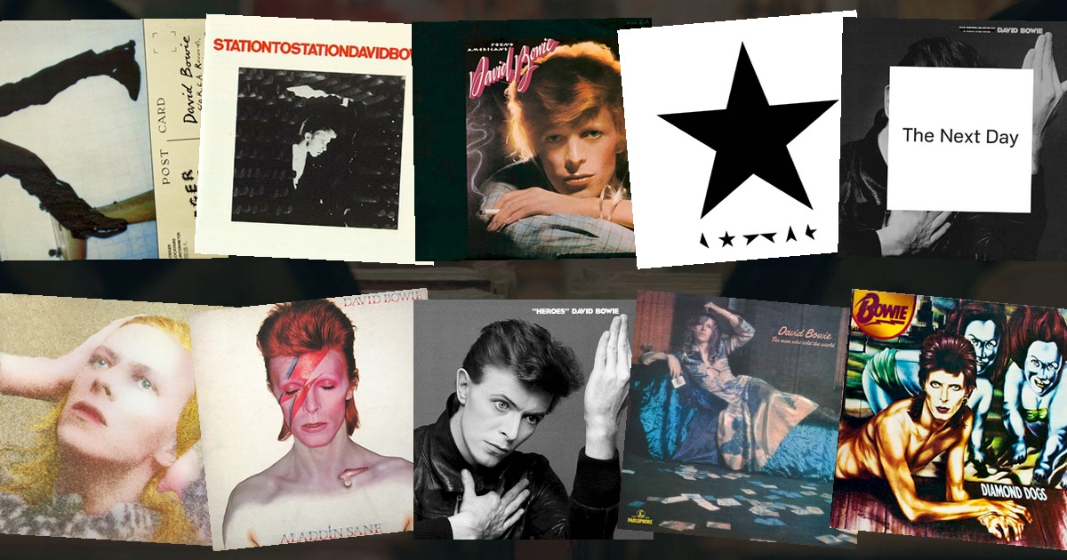
David Bowie didn't have album covers — he had looks. Every sleeve was another persona, another costume, another complete reinvention of who he was that week. No artist in rock used the cover as a piece of performance quite the way he did.
Here are all 15 David Bowie album covers we have in the game, ranked from the most recognisable to the least.
1. Aladdin Sane (1973)
 Aladdin SaneDavid Bowie · 1973
The lightning bolt across the face, the closed eye, the streak of red — Brian Duffy's photograph is arguably the single most recognisable image in rock history. It was painted onto Bowie's face for the shoot and has never stopped being imitated since. The bolt is so iconic it now means "Bowie" without any name attached.
2. The Rise and Fall of Ziggy Stardust and the Spiders from Mars (1972)
 The Rise and Fall of Ziggy Stardust and the Spiders from MarsDavid Bowie · 1972
Bowie as Ziggy, standing in a London doorway on Heddon Street at night, one foot up, looking like a visitor from a friendlier planet. Shot by Brian Ward, it's the birth of the alien that would take over British pop — and the door itself is still a pilgrimage site.
3. "Heroes" (1977)
 HeroesDavid Bowie · 1977
The famous hand gesture — two right angles meeting in the air, one hand reaching up, the other holding still. It's a photograph of pure gesture, so stripped-back and strange that it's become a symbol of creative reaching. Often read as a nod to the artist Erich Heckel, though Bowie claimed it simply happened.
4. Low (1977)
 LowDavid Bowie · 1977
Bowie's profile against a flat orange background, half in shadow, under the title Low in white. It's the cover that announced his Berlin period — austere, cold, deliberate — and it set the template for a decade of sleeves that were more design than photograph.
5. Hunky Dory (1971)
 Hunky DoryDavid Bowie · 1971
Bowie with long golden hair, staring past the camera, shot in soft, almost sepia light. It's the quiet cover before the storm — the last moment of the folk-adjacent Bowie before Ziggy arrived — and it's aged into something gently iconic precisely because it's so unassuming.
6. Blackstar (2016)
 BlackstarDavid Bowie · 2016
A black star — actually the five-pointed shape cut into a black field, with fragments of a star scattered below. Designed by Jonathan Barnbrook, it's one of the most elegant covers ever made, and it took on an unbearable weight when Bowie died two days after release. The sleeve was the goodbye.
7. Scary Monsters (and Super Creeps) (1980)
 Scary Monsters (and Super Creeps)David Bowie · 1980
Bowie as a pierrot clown, the white face and black cross, overlaid with the angular, paint-stroke lettering of the title. It's a cover that deliberately references his own past — the clown from the "Ashes to Ashes" video — and it reads as the album that closed the 70s chapter for good.
8. Diamond Dogs (1974)
 Diamond DogsDavid Bowie · 1974
The famous half-man, half-dog painting by Guy Peellaert, a grotesque creature sprawled across a stage. It was controversial on release — the original pressing showed the creature's genitals, later airbrushed out — and it remains the most unsettling, ambitious sleeve Bowie ever approved.
9. The Man Who Sold the World (1970)
 The Man Who Sold the WorldDavid Bowie · 1970
Bowie reclining in a flowing dress, hair long, looking uncannily beautiful and entirely unbothered. It was scandalous in 1970, and it was the first hint that Bowie was going to treat gender as just another costume to try on. The US label was so nervous they put a cartoon cowboy on the American version instead.
10. Space Oddity (1969)
 Space OddityDavid Bowie · 1969
A close-up of Bowie's face, blue and green and washed-out, looking like the astronaut Major Tom might have looked drifting alone. It's a folk-era sleeve with a sci-fi tint — a hint that the man on the cover was already dreaming of leaving the planet.
11. Station to Station (1976)
 Station to StationDavid Bowie · 1976
A still from The Man Who Fell to Earth, Bowie as the alien Thomas Jerome Newton. It's a cover that borrows a film image rather than creating one — effective, but it's the one sleeve where Bowie the actor did the work instead of Bowie the performer.
12. Let's Dance (1983)
 Let's DanceDavid Bowie · 1983
Bowie as a boxer, fists raised, shot in stark black and white. It's the sleeve for his big, glossy pop decade — striking, but more a product of the MTV era's slickness than of any new persona. The cover is cool; the album is cooler.
13. Young Americans (1975)
 Young AmericansDavid Bowie · 1975
Bowie exhaling smoke against a dark background, shot in grainy, almost documentary light. It's a moody, atmospheric cover that suited the soul-inflected record, but it lacks the single iconic image that the sleeves around it all had.
14. Lodger (1979)
 LodgerDavid Bowie · 1979
Bowie as a reclining accident victim, wrapped in bandages and braces, from the cover shoot for the album's promotional material. It's the final part of the Berlin trilogy, and the most deliberately awkward sleeve of the run — a cover that makes you look away before it makes you look again.
15. The Next Day (2013)
 The Next DayDavid Bowie · 2013
A white square pasted over the cover of "Heroes", defacing his own most famous image with the new album's title. It was a brilliant, cryptic gag — the comeback announced by scribbling over the past — but as a cover it's more concept than image, and it leans entirely on the sleeve it's hiding.
The albums we're missing
Bowie released twenty-six studio albums, so we're still building him out — we're missing Black Tie White Noise, 1. Outside, Earthling, Hours, Heathen and Reality, among others. We'll add them to the game as we go.
That's the thing about Bowie: every sleeve is a different person, which makes him endless quiz material. See how few tiles it takes to name Aladdin Sane in today's VinylPeek, or browse every rock cover in the archive. If you liked this, rank Queen's sleeves next.