What does the Dark Side of the Moon prism mean?
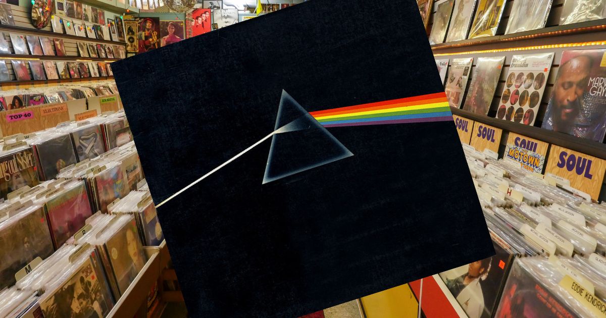
Short version: the prism on Pink Floyd's The Dark Side of the Moon was designed by Storm Thorgerson of Hipgnosis in 1973. It represents three things at once — the band's light show, the clarity of the record's production, and the themes of the lyrics — and the band chose it from a handful of options in a matter of minutes.
 The Dark Side of the MoonPink Floyd · 1973
What it represents
Thorgerson and Hipgnosis presented several ideas. Keyboardist Richard Wright is generally credited with pushing for the prism, and the design was intended to work on three levels:
The stage show. Pink Floyd's live performances were built around lighting, and a beam splitting into a spectrum is the most elegant possible shorthand for that.
The music. The record is famously clean and precisely separated — a white beam resolving into distinct colours is a fair visual description of what the production actually does.
The lyrics. The album's subjects — pressure, madness, money, time — are ordinary human experience broken into its parts and examined separately. Which is, more or less, what a prism does to light.
The gatefold continues the beam across the spread and back into a prism on the reverse, so the artwork loops when the sleeve is opened out.
What it isn't
The refraction is not physically accurate. There is no reflected beam, the spacing of the colours isn't right, and light doesn't behave quite like that through a real prism.
That was a design decision, not a mistake. Accuracy would have produced a messier, less symmetrical image, and the whole point was an emblem you could hold in your head.
Why it's the most efficient cover ever printed
No text. No band name, no album title, nothing. In 1973 that was a genuine commercial risk; the image alone had to carry a record from a band who were successful but not yet enormous.
One idea, completely executed. A prism, a beam in, a spectrum out, black everywhere else. Nothing was added that could have been.
Every fragment is diagnostic. A triangle edge and two colour bands is enough. It is why the design works on a t-shirt, a phone case, a tattoo and a five-centimetre thumbnail equally well — almost nothing else in music does.
Who designed it
Hipgnosis — the London studio run by Storm Thorgerson and Aubrey Powell, who also made the burning handshake on Wish You Were Here, the children on the causeway for Led Zeppelin's Houses of the Holy, and the pig over Battersea Power Station on Animals.
 Wish You Were HerePink Floyd · 1975
 AnimalsPink Floyd · 1977
If you want the fuller picture of how that studio worked, we've written about Hipgnosis and the sleeves they made.
The prism is also, unsurprisingly, one of the fastest covers to identify in VinylPeek — most players get it in about four tiles. Browse more of the era in the 1970s archive.