Hipgnosis: the design studio behind rock's strangest album covers
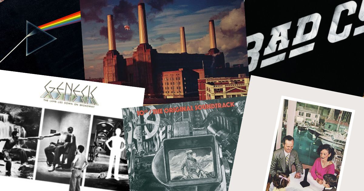
If you grew up with records, you know Hipgnosis's work even if you have never heard the name. The prism on The Dark Side of the Moon. The man on fire shaking hands. The children climbing the basalt causeway. The inflatable pig over Battersea Power Station.
All the same studio — and for about a decade, the reason British rock albums looked the way they did.
Who they were
Hipgnosis was founded in Cambridge and then London in the late 1960s by Storm Thorgerson and Aubrey "Po" Powell, later joined by Peter Christopherson. They knew Pink Floyd socially before the band was famous, which is how they got the work that made them.
The name came from a piece of graffiti on their door — a pun on "hypnosis" and "gnosis", knowledge. It suited them: the sleeves are meant to make you look twice and then think.
What made a Hipgnosis cover
Four habits show up again and again.
They photographed things rather than illustrating them. Where their contemporaries commissioned airbrushed fantasy paintings, Hipgnosis built the impossible thing and took a picture of it. That is why the images unsettle — some part of your brain registers that this actually happened.
They left the band off. No portraits, frequently no band name, sometimes no title. A sleeve was allowed to be an image rather than an advertisement.
They ran on a single idea. One object, one event, one joke — executed completely and with nothing else competing for attention.
They were funny. Not obviously, but the humour is there once you notice it.
The sleeves
Pink Floyd — The Dark Side of the Moon (1973)
 The Dark Side of the MoonPink Floyd · 1973
A prism, a white beam in, a spectrum out, on black. The most efficient cover ever printed, and the one everyone can draw from memory. No text on the front at all.
Pink Floyd — Wish You Were Here (1975)
 Wish You Were HerePink Floyd · 1975
Two businessmen shaking hands on a studio backlot, one of them alight. A stuntman in a fire suit, shot for real. The reason it lands is that neither man reacts — the horror is treated as routine.
Led Zeppelin — Houses of the Holy (1973)
 Houses of the HolyLed Zeppelin · 1973
Children climbing a causeway toward an orange sky, assembled from many exposures shot over several days at the Giant's Causeway in Northern Ireland. Uncanny rather than beautiful, and again with no type on the front.
Pink Floyd — Animals (1977)
 AnimalsPink Floyd · 1977
An inflatable pig floating over Battersea Power Station. Almost the entire image is an ordinary photograph of a real building — the surrealism is confined to exactly one element, which is why it works.
Led Zeppelin — Presence (1976)
 PresenceLed Zeppelin · 1976
Family scenes from an idealised past, each with a small black obelisk sitting in the middle of them, unremarked. Nobody explains the object. That restraint is the whole design.
10cc — The Original Soundtrack (1975)
 The Original Soundtrack10cc · 1975
A pastiche of a film poster, playing the album's title completely straight. The studio was as happy doing a visual gag as a piece of surrealism.
Genesis — The Lamb Lies Down on Broadway (1974)
 The Lamb Lies Down on BroadwayGenesis · 1974
Panels of muted, dreamlike scenes across a gatefold. Built to reward the several minutes you spent holding the record while side one played.
Bad Company — Bad Company (1974)
 Bad CompanyBad Company · 1974
Nearly bare: a plain field, small type, enormous confidence. Evidence that the studio's instinct was subtraction rather than decoration.
The afterlife
Hipgnosis dissolved in the early 1980s — Thorgerson later said the arrival of the pop video took the budgets and the attention. But Thorgerson kept designing for decades, and the visual approach kept appearing on records long after the studio's name stopped being on them.
 AbsolutionMuse · 2003
 AudioslaveAudioslave · 2002
Both from a much later era, both recognisably from the same school of thought: build the strange thing, photograph it plainly, leave the band out of it.
Why it still matters
Look at a modern release page and count how many sleeves are the artist's face, centre-frame, on a neutral ground, with the name in a sans serif. Beautiful, often. Identifiable from a corner, almost never.
Hipgnosis's covers pass that test effortlessly, and they pass it because the studio was solving a different problem: not "how do we show the band" but "what image would make someone pick this up".
You can find out how well those images have lodged in your own memory — today's VinylPeek hides a cover behind 64 tiles and asks you to name it from as little as you can manage. The Floyd sleeves tend to go in about four.