Why do modern album covers all look the same?
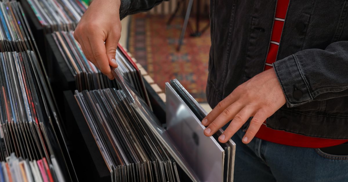
Here is a test you can run in about thirty seconds. Open any streaming app, scroll the new releases, and try to describe five of the covers from memory afterwards.
Most people manage one, and usually because they already knew the artist.
Now do the same with a shelf of records from 1973. You will get most of them, and you will get them from a corner.
Something has genuinely changed, and it isn't that designers got worse.
What the modern sleeve looks like
There is a house style, and once you see it you cannot stop seeing it: the artist's face, centre-frame, on a neutral or gently graded background, with the name in a clean sans serif.
It is often beautifully executed. The photography is better than it has ever been, the retouching is invisible, the typography is competent. And it is nearly impossible to identify from a fragment, because a well-lit face on a soft background is the one image every other release is also using.
Three things that caused it
The canvas shrank, then shrank again. A twelve-inch sleeve was held at arm's length while the record played. A CD case was five inches. A streaming thumbnail is somewhere around 60 pixels on a phone. Detail that rewarded a second look is now literally invisible, so it stops being commissioned.
The cover became an avatar. On a shelf, a sleeve competed with other sleeves. In an app, it sits next to the artist's profile picture, their playlist art, their social avatars. The commercial pressure is to be consistent and recognisably them, not to be a strange object — and a face does that job better than a prism.
The brief changed. Compare it directly:
 The Dark Side of the MoonPink Floyd · 1973
No band name. No title. No faces. Nobody at the label could have known this would sell — it works because someone was asked "what image would make a person pick this up", not "how do we show the band".
The covers that still work
The interesting thing is that some modern sleeves absolutely do survive the thumbnail. They just follow the older rules.
 DiscoveryDaft Punk · 2001
Two helmets, gold and silver, on red. Pure iconography — no faces to recognise, which is precisely the point, and it reads at any size.
 GraduationKanye West · 2007
A commissioned artwork rather than a photograph. Whatever you think of it, you can describe it from memory, which is more than most releases of its decade manage.
 OK ComputerRadiohead · 1997
Washed-out, corrupted, illegible in places. It looks like a mistake and is completely unmistakeable.
The rules that survive shrinking
Look at what those three have in common with the seventies sleeves:
- One object on a plain field, not a person in an environment
- A graphic mark rather than a photograph
- A colour so specific it works as a signature
- Texture unique enough to survive being cropped
None of that requires a big budget. The Ramones' debut cost almost nothing. Unknown Pleasures is white lines on black. What it requires is a willingness to not put the artist on the front — and that is a commercial decision, not a design one.
Is it actually a problem?
Honestly: for the artist, often not. If your cover's job is to make your releases look consistent in a feed, a well-lit portrait does that job well.
But something is lost, and it is the thing this whole site is built on. A cover that can be recognised from a fragment is a cover that lodges in a culture's memory. Fifty years on, people can draw the prism.
It is hard to imagine anyone drawing this year's number one from memory in 2075.
Test the theory yourself — today's VinylPeek hides a cover behind 64 tiles and scores you on how few you need. You will find that the older records give themselves away far sooner, and now you know why. Or browse the full archive by decade and watch the shift happen.