The Beatles album covers ranked
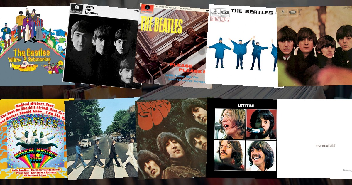
No band owns its visual identity the way the Beatles do. Across thirteen albums they produced the single most famous cover ever made, the most parodied, and the most audaciously blank — often while the music itself was rewriting the rules. Four men from Liverpool, and somehow every sleeve still feels inevitable.
Here are all 13 Beatles album covers we have in the game, ranked from the most recognisable to the least.
1. Abbey Road (1969)
 Abbey RoadThe Beatles · 1969
Four men on a zebra crossing outside EMI Studios, taken by Iain Macmillan from a stepladder in ten minutes on 8 August 1969. The photograph launched a thousand imitations — every band with a record deal has recreated it at least once — and turned a perfectly ordinary North London street into a pilgrimage site. It's the cover that outgrew the album it was wrapped around.
2. Sgt. Pepper's Lonely Hearts Club Band (1967)
 Sgt. Pepper's Lonely Hearts Club BandThe Beatles · 1967
Peter Blake's cardboard collage of more than seventy famous faces, the Beatles in satin military jackets at the centre of their own waxwork museum. It won the Grammy for Best Album Cover in 1968 and became the first sleeve people actually read, hunting for every hidden celebrity. No cover has ever been so densely pickable.
3. The Beatles (The White Album, 1968)
 The BeatlesThe Beatles · 1968
A blank white sleeve with the band's name embossed in barely-there grey — Richard Hamilton's answer to the riot of colour that was Sgt. Pepper. The original pressings even carried a stamped serial number, so every copy was, in theory, a limited edition. The most famous "empty" cover in music, and the most fearless piece of anti-design ever released.
4. Revolver (1966)
 RevolverThe Beatles · 1966
Klaus Voormann's black-and-white line drawings, the four faces sprouting out of a whirl of hair and sketch. Voormann was a friend from the Hamburg days, and his sleeve feels hand-made in exactly the way the band was about to stop being. It won the 1967 Grammy, one of the few covers to beat its own band to the punch.
5. Rubber Soul (1965)
 Rubber SoulThe Beatles · 1965
The famously stretched, distorted photograph — the result of a slide projector tilting while Robert Freeman's shot was projected onto a piece of cardboard. The band saw the warped image and decided they liked it better than the original. A happy accident that invented the psychedelic sleeve two years early.
6. A Hard Day's Night (1964)
 A Hard Day's NightThe Beatles · 1964
Twenty black-and-white headshots arranged in a grid, each face pulling a slightly different expression. It reads like a film contact sheet, which is exactly what it was promoting — the album and the movie of the same name, sold as one. The definitive early-Beatles image.
7. Help! (1965)
 Help!The Beatles · 1965
The four of them holding their arms out to spell a word in semaphore — except the flags don't actually spell "HELP". They spell "NUJV", because the band tried the correct poses and thought it looked too tidy, so they settled on the messier version. A cover whose imperfection is the whole joke.
8. Please Please Me (1963)
 Please Please MeThe Beatles · 1963
Angus McBean's shot looking down the stairwell at EMI House in Manchester Square, the four grinning faces peering up over the balustrade. The debut sleeve that introduced the world to four lads who looked like they were having the time of their lives — because they were.
9. With the Beatles (1963)
 With the BeatlesThe Beatles · 1963
Robert Freeman's moody half-shadow portraits, the four faces emerging from darkness. It's the moment the Beatles stopped being the grinning boys of Please Please Me and started looking like a proper rock band — half-lit, unsmiling, quietly serious.
10. Let It Be (1970)
 Let It BeThe Beatles · 1970
Four separate portraits on a black background, each member isolated in his own frame — an accidental prophecy for a band that was falling apart. Shot during the tense Get Back sessions, it's the sleeve that documents the end without meaning to.
11. Magical Mystery Tour (1967)
 Magical Mystery TourThe Beatles · 1967
The band in garish costume — John in a walrus suit, Ringo as a sort of psychedelic ringmaster — a still from the film of the same name. It's the most dated of the run, pure 1967 psychedelia committed to card, but unmistakably of its moment.
12. Yellow Submarine (1969)
 Yellow SubmarineThe Beatles · 1969
The cartoon sleeve from the animated film, all blue meanies and yellow submarines. Charming, but the album itself was half a soundtrack and half rehashed singles, and the cover is the least Beatles of the lot — the first time the band's image was handed to someone else entirely.
13. Beatles for Sale (1964)
 Beatles for SaleThe Beatles · 1964
An autumn park photograph, the four of them in scarves and coats, looking tired — which they genuinely were, midway through a punishing tour schedule. It's the most conventional sleeve in the catalogue, a portrait that could belong to any band of the era, and the one that says the least.
The one cover everyone copies
What's remarkable about the Beatles' sleeves is how little they share — a stairwell, a collage, a blank square, a crossing — and yet every one is instantly, globally recognisable. No designer held the whole run together; the band just had an instinct for one bold, simple image, committed to fully, that outsold a hundred cleverer ideas.
And that's precisely why they're perfect quiz material. A crossing, a zebra-suited Sgt. Pepper, an empty white square — see how few tiles it takes to name Abbey Road in today's VinylPeek, or browse every rock cover in the archive. If you liked this, rank Led Zeppelin's sleeves next.