How well do you know Motown album covers?
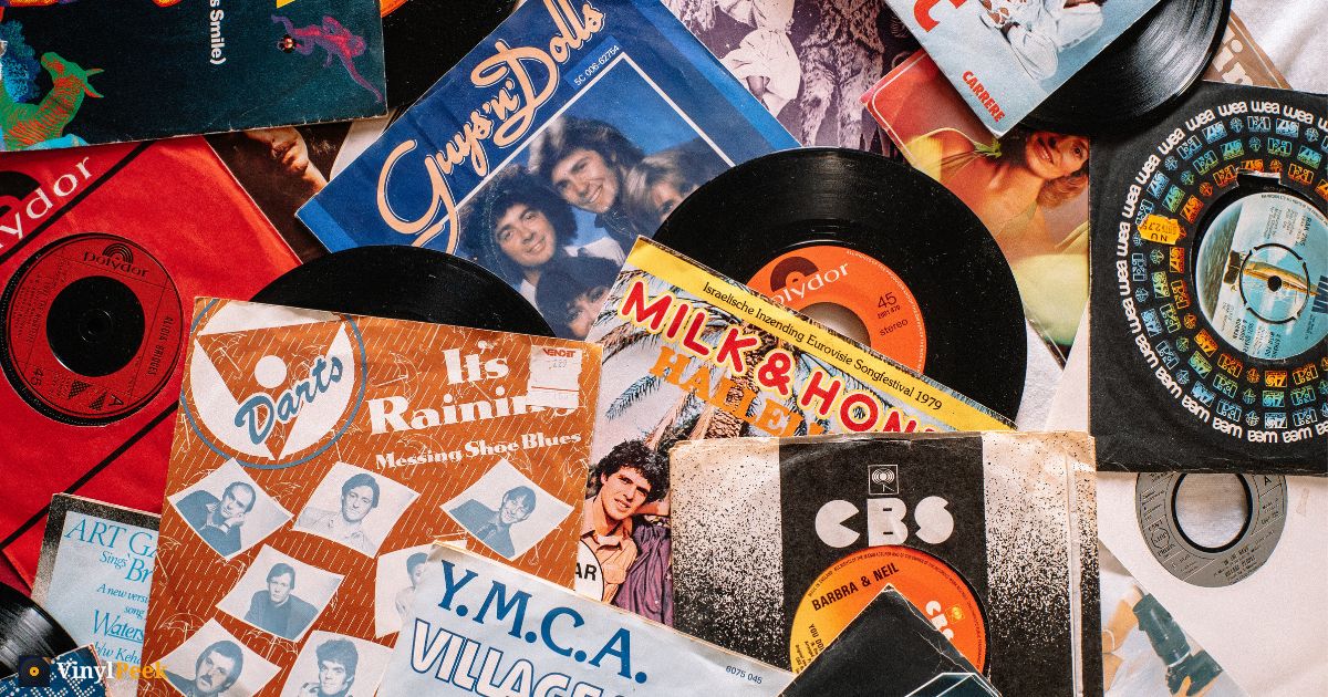
Here's a quiz that catches nearly everyone out. Name five Motown albums.
Most people who love the music can reel off twenty songs and stall at two records. That isn't a gap in your knowledge — it's an accurate reflection of how the label worked, and it makes Motown sleeves one of the most interesting things you can be tested on.
Motown was a singles company
Berry Gordy founded the label in Detroit in 1959 and built it around the 45. The Hitsville operation was tuned to produce singles at a rate almost nobody has matched before or since, and albums were frequently assembled afterwards — a couple of hits and whatever else was ready.
That shows in the artwork. A lot of mid-sixties Motown covers are, frankly, functional: a studio portrait of the group, the name in a plain typeface, a colour block behind. The budget and the attention went into the record, not the sleeve.
You can see it directly in the catalogue. Look at Where Did Our Love Go from 1964, or Heat Wave from 1963, and then at almost any album released ten years later. The distance is enormous.
This makes early Motown genuinely hard to identify from fragments. The covers share a visual language deliberately — they were house style, like a book series — so a corner of one looks very much like a corner of another.
Then something changed
Around the end of the sixties the label's artists started making albums as albums, and the sleeves changed with them.
Cloud Nine and Psychedelic Shack put the Temptations in an entirely different visual world — the studio portrait replaced by colour and graphic invention. Stevie Wonder's run through the seventies is the clearest case of all: compare My Cherie Amour from 1969 with Innervisions from 1973 or Songs in the Key of Life from 1976. The artist has taken control of the object, and the cover is now part of the statement.
Motown moved its operation to Los Angeles in 1972, and the sleeves of the years either side of that move are where the label stops looking like a hit factory and starts looking like a record company with auteurs on it.
What to look for
If you're trying to place a Motown-era sleeve from a small piece of it, a few things help:
- Flat, saturated background colour with a portrait in front is a strong sixties signal. The colours are printed flat because they were cheap to print flat.
- A group arranged in a diagonal line, tallest at the back, is the classic Detroit publicity-shot composition.
- Warm brown and orange grading puts you in the early seventies almost regardless of label.
- Hand-drawn or illustrated art on a soul record generally means 1970 or later. The sixties sleeves are photographs.
That last one is a useful shortcut across the whole genre, not just Motown.
Motown is soul, not its own shelf
One deliberate choice worth explaining: on VinylPeek, Motown sits inside soul rather than standing as its own genre. It's a label, an extraordinary one, but splitting it out would separate records that belong on the same shelf as Aretha Franklin on Atlantic and Otis Redding on Stax — and those artists are part of the same conversation.
So the soul collection runs from Sam Cooke through Detroit and Memphis to Al Green and Curtis Mayfield.
Try it
VinylPeek hides an album cover behind 64 cardboard tiles and lets you peel them back a row or a column at a time — the fewer you need, the higher you score. The soul collection is ten rounds of exactly the test above, and the early Motown sleeves are properly difficult in a way that has nothing to do with how well you know the songs.
You'll know every track. That's not the question being asked.