The most recognisable album covers ever made
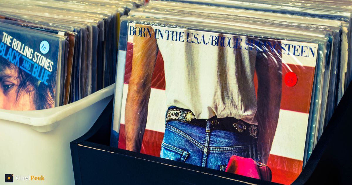
There's a particular test an album cover can pass. Cover ninety per cent of it, show someone the rest, and see whether they name it.
Very few images of any kind pass that test. A handful of album sleeves pass it easily, and they tend to pass it for the same reasons: one idea, executed at high contrast, with no competing detail. Here are fifteen that do, and what makes each one survive being reduced to a fragment.
1. The Dark Side of the Moon
 The Dark Side of the MoonPink Floyd · 1973
The most efficient cover ever printed. A prism, a white beam in, a spectrum out, on pure black. No text on the front at all. You need roughly one triangle edge and two colour bands to be certain, which is why it's on more t-shirts than any other record.
2. Nevermind
 NevermindNirvana · 1991
Underwater blue, a baby, a dollar on a fish hook. The blue alone does most of the work; it's a very specific pool-water turquoise that almost nothing else uses, and it fills most of the frame — so most fragments of this sleeve are pure signal.
3. Abbey Road
 Abbey RoadThe Beatles · 1969
Four men on a zebra crossing. The information is entirely in the silhouette and the white stripes — colour, faces and typography are all optional. Crop it to a single pair of legs mid-stride against those stripes and most people still get there.
4. The Velvet Underground & Nico
 The Velvet Underground & NicoThe Velvet Underground · 1967
A banana on white. Andy Warhol's design is so spare that a single curve of yellow against a white field is enough. Nothing else in popular music looks remotely like it, which is the entire trick.
5. Aladdin Sane
 Aladdin SaneDavid Bowie · 1973
The lightning bolt. Red and blue, edge to edge across a face, on skin lit almost to white. You need about a centimetre of the diagonal — and because the bolt runs corner to corner, almost any slice of the middle of the sleeve contains some of it.
6. Sticky Fingers
 Sticky FingersThe Rolling Stones · 1971
Warhol again, and again one idea: a close crop of jeans, with a working zip on the original sleeve. Denim blue plus a metal zip in that position is unmistakable, and denim texture is unusually distinctive at close range.
7. Thriller
 ThrillerMichael Jackson · 1982
The white suit against black. It's the tonal split that identifies it — a bright block low in the frame on a dark ground — rather than the face, which is the part most people would describe if you asked them.
8. Rumours
 RumoursFleetwood Mac · 1977
The odd one out here: hard to describe from memory, instantly known on sight. Two figures, a pose that reads like a tarot card, warm muted colour. It's a recognition cover rather than a recall cover, and there are far more of those than you'd think.
9. Purple Rain
 Purple RainPrince · 1984
Purple smoke, a motorcycle, a figure looking straight out at you. The colour grade is so committed that the palette alone narrows it to one record — you can identify this sleeve from a patch containing no object at all.
10. Sgt. Pepper's Lonely Hearts Club Band
 Sgt. Pepper's Lonely Hearts Club BandThe Beatles · 1967
The opposite strategy to everything above: maximum detail, dozens of faces, a crowd. It works because the texture is unique. Even a corner of that collage — cut-out heads at slightly wrong scales against a bright ground — looks like nothing else.
11. Master of Puppets
 Master of PuppetsMetallica · 1986
Rows of white crosses receding into a blood-red sky, with puppet strings coming down from above. Two colours doing all the work, and a repeating shape that reads instantly from a sliver. It's arguably the most identifiable metal sleeve ever made.
12. Highway to Hell
 Highway to HellAC/DC · 1979
A band photograph, which should make it hard — except Angus Young is in the schoolboy uniform with horns, and that single detail collapses the search space to one record. Not every cover needs a graphic idea; some just need one impossible object in the frame.
13. Rising
 RisingRainbow · 1976
A painted fist rising out of the sea, grasping a rainbow, under a churning sky. Fantasy illustration was everywhere in seventies hard rock, but the composition here — that one enormous central form against open water — is specific enough that a fragment of the fist or the rainbow gives it away.
14. Sabbath Bloody Sabbath
 Sabbath Bloody SabbathBlack Sabbath · 1973
A painted deathbed scene, all sickly greens and reds, figures crowded round a man on a bed. Dense and detailed like Sgt. Pepper, and identifiable the same way: the palette and the painted texture are the signature, not any single element.
15. Pump
 PumpAerosmith · 1989
Two trucks, one mounted on top of the other, photographed plainly against a light ground. It's absurd, it has nothing to do with the music, and it is completely unforgettable — which is a reminder that recognisability and good taste are unrelated variables.
The pattern
Look back over the list and the successful strategies are few:
- One object on a plain field. The prism, the banana, the fist, the trucks.
- A graphic mark rather than a photograph. The lightning bolt, the crosses.
- A colour so specific it functions as a signature. Nevermind blue, Purple Rain purple, Master of Puppets red.
- Texture unique enough to survive cropping. Sgt. Pepper, Sabbath Bloody Sabbath.
- One impossible detail. Angus Young's horns; a truck on a truck.
What fails the fragment test is the default modern sleeve: an artist's face, centre-frame, on a neutral background, with the name in a sans serif. Beautiful, often. Identifiable from a corner, almost never.
Test yourself properly
Reading a list is not the same as being tested. VinylPeek hides a cover behind 64 cardboard tiles and lets you peel them a row or a column at a time — the score is simply how little you needed to see. Most people are far better at this than they expect and far worse at describing covers from memory than they expect, both in the same sitting.
There are thousands of sleeves in the archive, or you can go straight to today's puzzle.