Every Radiohead album cover, ranked
No band has a closer relationship with its sleeve designer than Radiohead and Stanley Donwood. Since 1995, Donwood has made the artwork for every single Radiohead record — often sitting in the studio while the album was still being finished, absorbing whatever the band were going through and turning it into an image. The result is the most consistent visual identity in modern music: nine covers that look nothing alike, yet are all unmistakably, instantly, Radiohead.
Here are all nine Radiohead album covers, ranked from the most recognisable to the least.
1. Kid A (2000)
 Kid ARadiohead · 2000
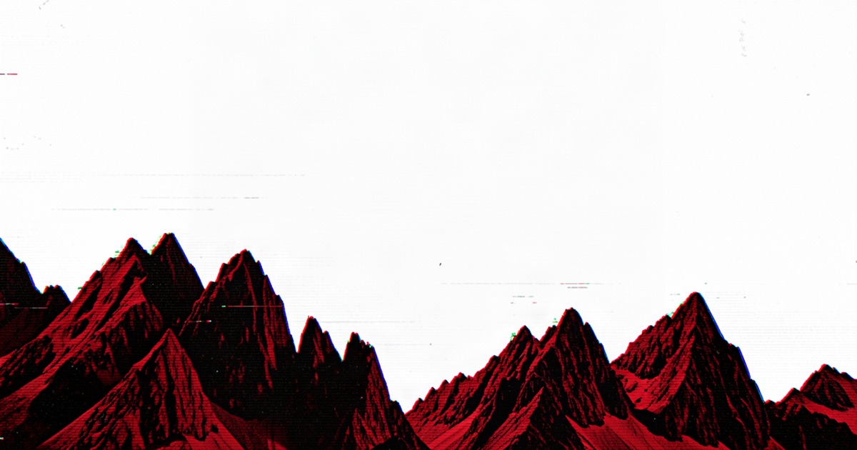
A mountain range in jagged red and black, distorted until it looks like a corrupted file or a warning from the future. Donwood painted it while the band were recording — a deliberate break from the photographic OK Computer into something abstract and digital. It didn't look like any album cover of its era, which was exactly the point, and it hasn't dated a day since.
2. OK Computer (1997)
 OK ComputerRadiohead · 1997
A bleached-out motorway interchange, white on white, with fragments of text that read like a malfunctioning sat-nav. It's the sound of the album made visible — cold, alienated, and quietly terrifying — and it predicted the next quarter-century of album art's drift toward the digital and the glitchy. You could crop this to a single grey-blue corner and still know exactly what record it is.
3. Amnesiac (2001)
 AmnesiacRadiohead · 2001
A weeping minotaur in red and black, drawn by Donwood while obsessed with the Minotaur legend and Piranesi's labyrinth etchings, then superimposed onto the yellowed page of an old book. Of all the Radiohead covers, this is the one that works hardest as a single image — one glance and you know you're looking at something ancient, sorrowful, and slightly wrong.
4. In Rainbows (2007)
 In RainbowsRadiohead · 2007
Bursts of ink and molten wax in full colour against black — ink squirted through hypodermic needles, wax poured like a mad alchemist, then scanned and pushed into colour. It's the warmest, most purely joyful image Donwood ever made for the band, and it landed at exactly the moment the band's music thawed out too. You can name it from a sliver of that colour, even from across a room.
5. Hail to the Thief (2003)
 Hail to the ThiefRadiohead · 2003
A painted road map of cities tied to the War on Terror — Los Angeles, Kabul, Grozny — their place names replaced by cut-up lyric fragments in brash, flat sign colours. It's the band's most explicitly angry cover, and the only one that works as satire as much as art. The image is the record's thesis statement.
6. A Moon Shaped Pool (2016)
 A Moon Shaped PoolRadiohead · 2016
Black-and-white swirls of paint, made in the south of France after a thunderstorm wrecked Donwood's wet canvases — stripped back to monochrome at a moment when everything else felt overcomplicated. It's beautiful, but it's also the least assertive of the covers: it whispers where the others shout.
7. The Bends (1995)
 The BendsRadiohead · 1995
A medical resuscitation dummy, photographed in harsh black and white, its face frozen somewhere between euphoria and a scream. It's the last Radiohead cover with a human figure on it, and it captures the album's sense of exhausted, narcotic release better than any of the more famous images that came after.
8. The King of Limbs (2011)
 The King of LimbsRadiohead · 2011
A ghostly figure made of branches and mist, half-tree, half-spectre, standing in a dark wood. It's the most atmospheric of the covers, but also the most elusive — ask someone what's on it and they'll describe a mood rather than an image. Which is fitting for an album that plays more like weather than songs.
9. Pablo Honey (1993)
 Pablo HoneyRadiohead · 1993
A baby's face behind a sunflower. It's a fine photograph, but it's also the only Radiohead cover that could belong to any band — made before Donwood's visual identity existed. Nobody names Pablo Honey from a fragment, and that's rather the point: the story of Radiohead's sleeves starts one album later.
One artist, nine records, no weak links
What makes the Radiohead discography so remarkable is the consistency of its vision. Donwood has co-authored the band's visual world for over thirty years — a working relationship with no real equivalent in rock, with Thom Yorke contributing art as "Tchocky" — and across nine albums the pair have never repeated themselves, never mailed one in, and never produced a sleeve that doesn't feel inevitable once you've seen it.
The covers also happen to make perfect quiz material: bold colour fields, a single dominant image, almost nothing extraneous. That's the whole game, really — how few tiles before you name it? See how quickly Kid A's red mountains give themselves away in today's VinylPeek, or browse the full Radiohead archive. If you enjoyed this, rank Pink Floyd's sleeves next.