The most recognisable hip hop album covers
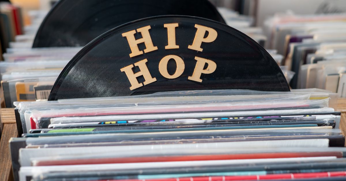
Hip hop worked out something about album art quickly that other genres took decades to learn: a sleeve is a logo problem, not a portrait problem.
The covers below survive being shrunk to a thumbnail, printed on a t-shirt, or cropped to a corner — because most of them were built around a single mark, a single face, or a single colour.
1. Nas — Illmatic (1994)
 IllmaticNas · 1994
A childhood photograph superimposed over a Queensbridge street, in sepia. The double exposure is the identifier — almost nothing else layers a portrait over a cityscape this way.
2. The Notorious B.I.G. — Ready to Die (1994)
 Ready to DieThe Notorious B.I.G. · 1994
A baby with an afro on a plain white field. Enormous negative space at a time when the shelf was crowded and busy, which is exactly why it still stands out.
3. Wu-Tang Clan — Enter the Wu-Tang (36 Chambers) (1993)
 Enter the Wu-Tang (36 Chambers)Wu-Tang Clan · 1993
Masked figures in yellow-tinted murk. The sleeve is atmospheric, but the W is the real design — one of very few band logos in any genre that became more famous than the record it launched.
4. Beastie Boys — Licensed to Ill (1986)
 Licensed to IllBeastie Boys · 1986
An illustrated jet, folding across a gatefold, with a joke in the tail number: 3MTA3 reads EATME in a mirror. Cartoon art on a rap record, and it set the tone for everything the group did afterwards.
5. Run-D.M.C. — Raising Hell (1986)
 Raising HellRun-D.M.C. · 1986
Three figures, hats, chains, plain ground, enormous type. It established a template that hip hop sleeves used for the next decade, and it still reads instantly.
6. Public Enemy — It Takes a Nation of Millions to Hold Us Back (1988)
 It Takes a Nation of Millions to Hold Us BackPublic Enemy · 1988
The group behind bars, stark monochrome. The design makes the record's argument before a note plays — no other sleeve of the era is as unambiguous.
7. Dr. Dre — The Chronic (1992)
 The ChronicDr. Dre · 1992
A direct visual quotation of Zig-Zag rolling papers, with Dre's portrait in the frame. Borrowing packaging design wholesale, and it worked so completely that plenty of people know the sleeve without knowing the reference.
8. 2Pac — All Eyez on Me (1996)
 All Eyez on Me2Pac · 1996
Black and white, arms out, tattoos legible, name in huge type. A portrait doing logo work.
9. A Tribe Called Quest — Midnight Marauders (1993)
 Midnight MaraudersA Tribe Called Quest · 1993
A grid of faces in red, green and black. A design system rather than a photograph — and one the group extended across the release rather than using once.
10. Kanye West — Graduation (2007)
 GraduationKanye West · 2007
Takashi Murakami's Dropout Bear in saturated anime colour. The fine-art commission arriving in mainstream hip hop, and the beginning of a decade of rappers hiring gallery artists.
The pattern
Look back over the ten and the winning strategies are narrow:
- One face on a plain field. Ready to Die, All Eyez on Me.
- A mark that outlives the sleeve. The Wu-Tang W, the Public Enemy crosshairs.
- Borrowed visual language. Rolling papers, cartoon jets, gallery art.
What is almost absent is the thing that dominates modern releases: the artist photographed handsomely on a neutral background with the name in a clean sans serif. Those sleeves look expensive. They are also nearly impossible to identify from a fragment.
Browse the hip hop archive, or take on ten of them in Genre mode.