The best album covers of the 1990s
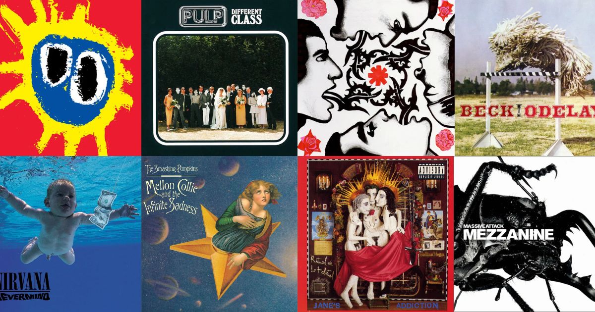
The 1990s is where the album cover starts to shrink. The CD jewel case cut the canvas from twelve inches to five, and by the end of the decade designers were already thinking about how a sleeve would look as a thumbnail. The best covers of the era work because of that constraint, not despite it.
1. Nirvana — Nevermind (1991)
 NevermindNirvana · 1991
Underwater blue, a baby, a dollar bill on a fish hook. The blue does most of the work — a very specific pool-water turquoise that fills the frame, so almost any fragment of it is pure signal.
2. Nas — Illmatic (1994)
 IllmaticNas · 1994
A childhood photograph superimposed over a Queensbridge street in sepia. The double exposure is the identifier; very few sleeves layer a portrait over a cityscape like this.
3. The Notorious B.I.G. — Ready to Die (1994)
 Ready to DieThe Notorious B.I.G. · 1994
A baby with an afro against a stark white background. Enormous negative space at a moment when hip hop sleeves were usually crowded, which is exactly why it stands out.
4. Radiohead — OK Computer (1997)
 OK ComputerRadiohead · 1997
Washed-out white, a bleached motorway interchange, fragments of text. Stanley Donwood's design looks like a corrupted file, and it predicted roughly the next twenty-five years of album art.
5. Massive Attack — Blue Lines (1991)
 Blue LinesMassive Attack · 1991
A flame graphic in flat red and black. Closer to a warning label than a record sleeve, and it gave Bristol trip hop an instant visual identity.
6. Weezer — Weezer (1994)
 WeezerWeezer · 1994
Four men standing awkwardly against a plain blue wall. Deliberately unglamorous, deliberately badly posed, and it became one of the most imitated covers of the decade.
7. Beck — Odelay (1996)
 OdelayBeck · 1996
A Hungarian puli mid-jump over a hurdle, from a dog-breeding magazine. Nobody would approve this today, which is roughly why it works.
8. The Prodigy — The Fat of the Land (1997)
 The Fat of the LandThe Prodigy · 1997
A crab on a bright ground, shot like a specimen. Aggressive electronic music with an image that has nothing to do with any of it — and that mismatch is the point.
9. Portishead — Dummy (1994)
 DummyPortishead · 1994
A grainy film still in monochrome. It looks like a frame from a lost sixties spy thriller, which is also a fair description of the record.
10. Lauryn Hill — The Miseducation of Lauryn Hill (1998)
 The Miseducation of Lauryn HillLauryn Hill · 1998
A portrait carved into a wooden school desk, title scratched in like graffiti. The concept and the craft are the same gesture.
11. Oasis — (What's the Story) Morning Glory? (1995)
 (What's the Story) Morning Glory?Oasis · 1995
Two figures passing on Berwick Street, motion-blurred, in flat London daylight. Ordinary to the point of anti-glamour, which was the whole Britpop proposition.
12. Rage Against the Machine — Rage Against the Machine (1992)
 Rage Against the MachineRage Against the Machine · 1992
A Malcolm Browne press photograph from 1963 Saigon, used without decoration. One of the very few sleeves that is genuinely difficult to look at, and it is doing exactly what the band intended.
13. Wu-Tang Clan — Enter the Wu-Tang (36 Chambers) (1993)
 Enter the Wu-Tang (36 Chambers)Wu-Tang Clan · 1993
Masked figures in yellow-tinted murk, with the logo doing the heavy lifting. That W has outlived the sleeve it arrived on.
14. Aphex Twin — Richard D. James Album (1996)
 Richard D. James AlbumAphex Twin · 1996
A close-crop grin, straight down the lens. Unsettling in a way that is hard to explain to someone who hasn't seen it, and instantly identifiable forever after.
15. Blur — Parklife (1994)
 ParklifeBlur · 1994
Greyhound racing at Walthamstow, in bright documentary colour. Like Morning Glory, it locates the record in a very specific England.
The decade the canvas shrank
The 1990s sleeve had to survive three things the 1970s sleeve never did: a five-inch case, a one-inch thumbnail in a record shop listing, and eventually a screen.
The covers that lasted responded in one of two ways. Some went graphic — the Wu-Tang W, the Massive Attack flame, the Blue Lines red — marks that shrink perfectly. Others went single subject on a flat field: one baby, one crab, one dog, nothing else in frame.
What dated badly is everything in between: busy composites, drop shadows, and the early digital collage that looked futuristic for about two years.
Browse the whole decade in the 1990s archive, or see how few tiles you need in today's VinylPeek.