The best album covers of the 1980s
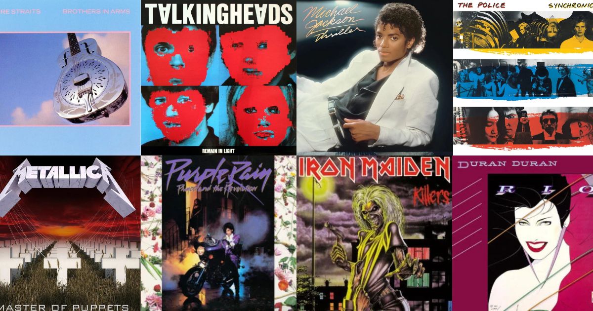
The 1980s pulled album art in two directions at once. On one side, designers like Peter Saville were stripping sleeves back to almost nothing. On the other, the biggest records in the world put the star on the front, lit like a film poster, and sold forty million copies.
Both are here.
1. Michael Jackson — Thriller (1982)
 ThrillerMichael Jackson · 1982
The white suit against black, one leg raised. Lit like a portrait sitting rather than a pop shoot, and identifiable by its tonal split — a bright block low in a dark frame — before you register the face.
2. Prince — Purple Rain (1984)
 Purple RainPrince · 1984
Purple smoke, a motorcycle, a direct look out of the frame. The colour grade is so committed that the palette alone narrows it to one record.
3. Joy Division — Closer (1980)
 CloserJoy Division · 1980
A photograph of a tomb sculpture, set in classical type. Peter Saville's austerity taken to its limit: no band name on the front, nothing that looks like rock music at all.
4. New Order — Power, Corruption & Lies (1983)
 Power, Corruption & LiesNew Order · 1983
A Fantin-Latour flower painting with a colour-coded stripe in the corner. Saville again, borrowing from the National Gallery and encoding the title in a colour key most buyers never decoded.
5. Metallica — Master of Puppets (1986)
 Master of PuppetsMetallica · 1986
Rows of white crosses receding into a blood-red sky, with puppet strings above. Two colours and one repeating shape — arguably the most identifiable metal sleeve ever made.
6. AC/DC — Back in Black (1980)
 Back in BlackAC/DC · 1980
An all-black sleeve with the embossed logo and nothing else. A design decision made in mourning that became the boldest cover of the decade by refusing to be a cover at all.
7. The Smiths — The Queen Is Dead (1986)
 The Queen Is DeadThe Smiths · 1986
A still from a French film, tinted green, with the title in stencilled type. The Smiths' entire visual identity was borrowed imagery treated consistently, and it is a masterclass in doing a lot with very little budget.
8. Talking Heads — Remain in Light (1980)
 Remain in LightTalking Heads · 1980
Four portraits with red blocks masking the faces — one of the first commercial sleeves made with computer graphics, and it still looks like nothing else.
9. Public Enemy — It Takes a Nation of Millions to Hold Us Back (1988)
 It Takes a Nation of Millions to Hold Us BackPublic Enemy · 1988
The group behind bars in stark monochrome. The design carries the argument of the record before a note plays.
10. Beastie Boys — Licensed to Ill (1986)
 Licensed to IllBeastie Boys · 1986
An illustrated jet with the tail number 3MTA3 — which reads as "EATME" in a mirror. A sleeve with a joke hidden in plain sight, folded across a gatefold.
11. Run-D.M.C. — Raising Hell (1986)
 Raising HellRun-D.M.C. · 1986
Three figures, hats, chains, plain background, huge type. It established a template that hip hop sleeves would use for a decade.
12. Sonic Youth — Daydream Nation (1988)
 Daydream NationSonic Youth · 1988
A single Gerhard Richter candle on black. Borrowed fine art again, and proof that one quiet object can carry a double album of guitar noise.
13. Aerosmith — Pump (1989)
 PumpAerosmith · 1989
Two trucks, one mounted on top of the other, photographed plainly. Absurd, unrelated to the music, and completely unforgettable — recognisability and good taste are unrelated variables.
The two eighties
The decade's split personality is the interesting part. Peter Saville's sleeves for Factory Records treated the cover as a design object with no obligation to advertise the band — no names, no faces, often no title. The blockbuster sleeves did the exact opposite: one star, perfectly lit, name in large type.
Both approaches still work today. What mostly doesn't survive from the decade is the middle ground — the airbrushed chrome lettering and gradient backgrounds that dated within about five years.
Browse the whole decade in the 1980s archive, or test yourself on today's VinylPeek.