The best album covers of the 1960s
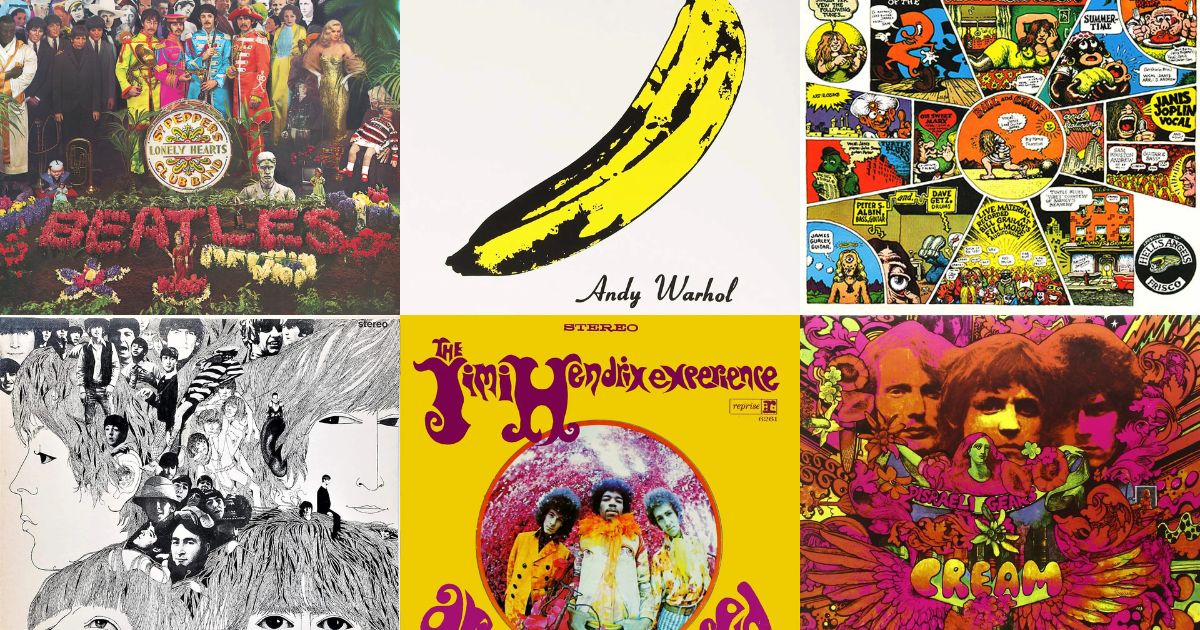
Before the 1960s, a record sleeve was packaging. It carried the artist's name, a photograph, and the track listing, and its job was to survive a shop rack. By the end of the decade it was a canvas, and a few of them were better known than the songs inside.
Here are eleven that made that happen.
1. The Beatles — Sgt. Pepper's Lonely Hearts Club Band (1967)
 Sgt. Pepper's Lonely Hearts Club BandThe Beatles · 1967
Peter Blake's crowd of cut-out celebrities is the moment the sleeve became the event. Maximum detail, dozens of faces, and a texture so specific that a corner of it is still identifiable.
2. The Velvet Underground — The Velvet Underground & Nico (1967)
 The Velvet Underground & NicoThe Velvet Underground · 1967
Andy Warhol's banana on a white field. The opposite strategy to Sgt. Pepper and just as effective: one object, no competing detail, nothing else in music that looks remotely like it.
3. The Beatles — Abbey Road (1969)
 Abbey RoadThe Beatles · 1969
Four men on a zebra crossing, shot in a few minutes on a summer morning. Everything identifying is in the silhouettes and the white stripes — you don't need the faces, the colour or a single word.
4. The Beach Boys — Pet Sounds (1966)
 Pet SoundsThe Beach Boys · 1966
The band feeding goats at a petting zoo. A famously literal reading of the title, and a reminder that the sixties sleeve was still half-improvised even at the top of the industry.
5. Bob Dylan — The Freewheelin' Bob Dylan (1963)
 The Freewheelin' Bob DylanBob Dylan · 1963
A couple walking arm in arm down a slushy Greenwich Village street. It looks like a snapshot, which is exactly the point — it sold an idea of a life, not a portrait of a musician.
6. The Jimi Hendrix Experience — Are You Experienced (1967)
 Are You ExperiencedThe Jimi Hendrix Experience · 1967
Fisheye lens, saturated colour, the band looming over the viewer. Psychedelia arriving in the photography rather than in an illustration.
7. Cream — Disraeli Gears (1967)
 Disraeli GearsCream · 1967
Fluorescent day-glo collage, hand-lettered type, no straight lines anywhere. If you want to date a sleeve to within about eighteen months, this is the visual language to look for.
8. Love — Forever Changes (1967)
 Forever ChangesLove · 1967
Four heads arranged into a single graphic form in flat, poster-like colour. It reads as a symbol rather than a photograph, which is why it survives being shrunk.
9. The Rolling Stones — Beggars Banquet (1968)
 Beggars BanquetThe Rolling Stones · 1968
The famous version is the plain one: a formal invitation card, all type, no image. When the original photograph was rejected the band shipped the most restrained sleeve of their career, and it became the more memorable object.
10. Miles Davis — Kind of Blue (1959)
 Kind of BlueMiles Davis · 1959
Just outside the decade, and the template for what jazz sleeves would look like through it: a tight crop, warm side-light, the musician mid-thought rather than posed.
11. The Beatles — Revolver (1966)
 RevolverThe Beatles · 1966
Klaus Voormann's line drawing with photographs woven into the hair. Illustration and photography in the same frame, which almost nobody was doing on a pop record in 1966.
What to look for in a sixties sleeve
Flat, saturated colour. Printing was cheap and flat, so designers worked with it rather than against it. A block of unmodulated colour behind a portrait is a strong sixties signal.
Photographs, not paintings. Illustration takes over in the seventies. If a sixties record has artwork rather than a photo, it's usually a late-decade psychedelic release.
Visible print texture. Offset dot patterns and slightly misregistered colour. You can often date a sleeve from a blank patch of background alone.
Browse the decade in the 1960s archive, or find out how many you'd actually recognise from a fragment in today's VinylPeek.