Arctic Monkeys album covers ranked
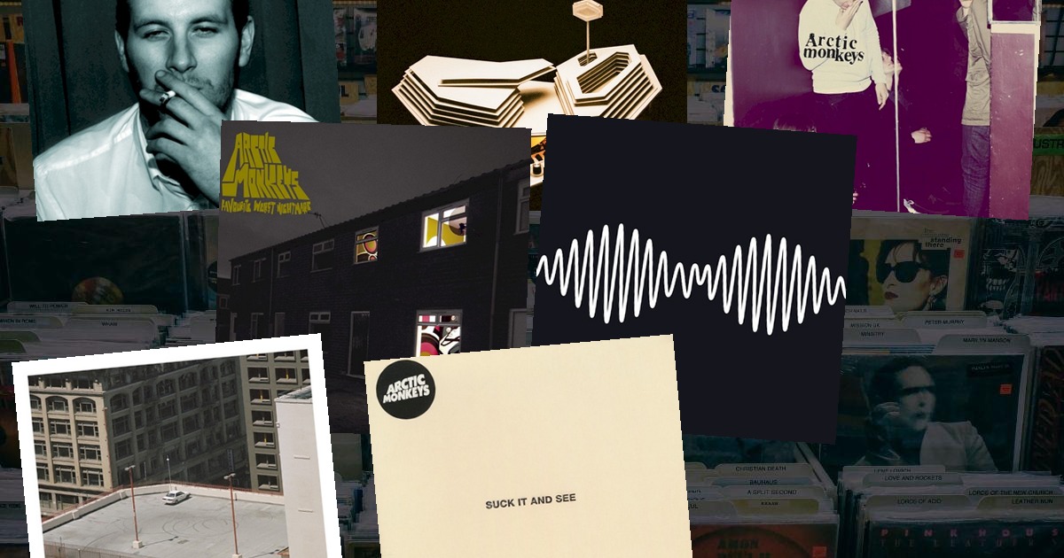
The Arctic Monkeys' sleeves chart the band's entire transformation — from a grainy shot of a mate smoking to the sleek, abstract minimalism of their later records. No other band's artwork tracks their evolution quite so cleanly.
Here are all 7 Arctic Monkeys album covers we have in the game, ranked from the most recognisable to the least.
1. AM (2013)
 AMArctic Monkeys · 2013
A single white waveform — the AM radio amplitude-modulation symbol — on a black background. It's one of the most elegant, instantly recognisable covers of the 2010s, and it's so clean you can spot it from the other side of a record shop. A cover that says "no sleeve needed".
2. Whatever People Say I Am, That's What I'm Not (2006)
 Whatever People Say I Am, That's What I'm NotArctic Monkeys · 2006
A black-and-white photograph of Chris McClure, a friend of the band, smoking a cigarette — shot at the Korova Bar in Liverpool. It's the cover that captured the band's origins better than any press photo could: a mate, a fag, and the North of England. The fastest-selling debut in UK history wore this image.
3. Favourite Worst Nightmare (2007)
 Favourite Worst NightmareArctic Monkeys · 2007
A terraced house at dusk, the windows glowing, a car parked outside — photographed from the street. It's the follow-up to the pub shot, the band looking outward at the ordinary Britain they'd just conquered. Quietly melancholy in a way the music was starting to be.
4. Humbug (2009)
 HumbugArctic Monkeys · 2009
A swirling, psychedelic photograph of the band, processed and warped into near-abstraction. It matched the heavier, stranger sound of the third album — the moment the Monkeys left Sheffield's streets behind and started making records in the desert.
5. Tranquility Base Hotel & Casino (2018)
 Tranquility Base Hotel & CasinoArctic Monkeys · 2018
A retro-futuristic hexagonal building, all mirrored glass and mid-century optimism — a rendering of the imaginary hotel Alex Turner sings about on the album. It's a concept-record sleeve for a concept record, and it commits fully to the bit.
6. The Car (2022)
 The CarArctic Monkeys · 2022
A single car parked in a bare car park, shot from above in muted, cinematic light. It's the most minimal sleeve the band have ever done — almost nothing on it, matching the album's late-night, lounge-y restraint.
7. Suck It and See (2011)
 Suck It and SeeArctic Monkeys · 2011
A plain, cream-coloured sleeve with the title in small type. Deliberately stark, it's the one cover in the catalogue that feels more like a placeholder than a statement — a breather between the psychedelia of Humbug and the icon of AM.
The cover as timeline
Few bands' sleeves tell their story as clearly as the Monkeys': a smoking mate, a terraced house, a desert haze, then the crisp geometry of AM. Each cover is a chapter, and each one is a single image you can't mistake for anything else.
Which is what makes them perfect quiz material. A waveform, a mate with a fag, a hexagonal hotel — see how few tiles it takes to name AM in today's VinylPeek, or browse every indie cover in the archive. If you liked this, rank Fleetwood Mac's sleeves next.